

Visual Intelligence
Learning to see what's already there
Walk into any high-end hotel lobby and something strange happens. Your voice automatically drops. Your pace slows. You find yourself standing straighter. The space hasn't asked you to do any of this, but somehow you know the rules.
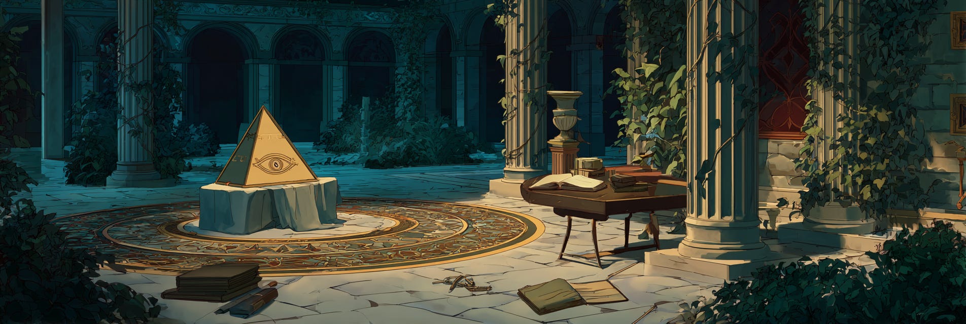
That's visual intelligence at work. Not yours—the space's. It's communicating through proportion, material, and light, speaking a language your body understands before your mind does.
Most of us think we're making choices. We pick this chair, that color, this layout. But really, we're responding to invisible forces we can't name. The restaurant that makes you order wine instead of beer. The website that feels trustworthy before you read a word. The office that drains your soul for reasons you blame on the job, not the fluorescents.
You're swimming in visual information every waking hour. Might as well learn to read the current.
The Weight of Air
Empty space isn't empty—it's the most expensive material in design. Every gap costs money. Every pause takes courage. Most people can't afford either, so they fill everything. Their rooms, their slides, their sentences. Horror vacui, the medievals called it. Fear of the void.
But watch what happens when someone's brave enough to leave things out. Walk into a gallery. Not a cluttered antique shop calling itself a gallery—a real one, where three paintings take up a wall that could hold twenty. The space between them isn't wasted. It's working. It's making you slow down, look closer, take the work seriously.
Same principle works everywhere. The email with three sentences lands harder than three paragraphs. The business card with just a name and number suggests you should already know who they are. The platform with one feature that works beats twenty that sort of work.
Space is confidence made visible. Use it like you've got nothing to prove.
Everything Is Talking
A designer once told me: "Put two objects in a room and they're having a conversation. Your job is to make sure they're not arguing."
This explained every uncomfortable room I'd ever entered. That friend with the inherited Victorian sofa and the IKEA shelves—visual argument. The restaurant with exposed brick, crystal chandeliers, and plastic chairs—full-blown domestic dispute. When objects speak different languages, the room feels like bad translation.
But when everything rhymes? Magic. Walk into a place where the doorknobs match the faucets match the light switches—not because someone bought a set, but because someone understood that brass talks to brass, that certain curves call for certain angles. You feel it in your body before your brain catches up. Coherence is calm.
The expensive mistake is thinking this means everything should match. That's not conversation—that's everyone saying the same word. Good visual dialogue needs variation within vocabulary. Like how a jazz quintet uses different instruments to play the same key. Or how a well-designed neighborhood mixes building heights but keeps a consistent material palette.
The Lies We Accept
Here's the paradox about scale: nothing is actually big or small. That massive sculpture in the park becomes tiny from a plane. Your cramped apartment feels palatial to someone living in their car. Size is pure context, but we pretend it's fixed.
This is why oversized mansions feel so wrong. They're using cathedral proportions for watching Netflix. The scale is lying about the purpose. It's like wearing a tuxedo to buy groceries—technically functional, fundamentally dishonest.
The smartest designers use scale like sleight of hand. Apple stores feel vast because the tables are hip-height and twenty feet apart. Boutique hotels feel intimate by raising the bed and lowering the ceiling. That dive bar you love feels cozy because everything's slightly too close together, forcing accidental community.
When you understand scale is negotiable, you stop accepting it as fixed.
Shape Grammar
Your body reads shapes faster than your mind reads words. Circle: safe. Triangle: move. Square: stable. Organic blob: human. It’s neurological. Babies know it. Dogs know it. You knew it before you knew anything.
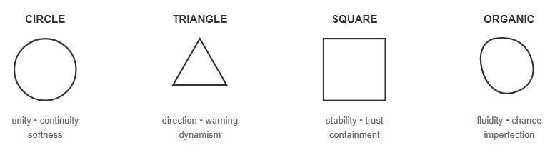
Watch how this plays out in logos. Banks love squares (stable, trustworthy, boring). Startups love circles (friendly, approachable, unthreatening). Energy drinks love triangles (aggressive, dynamic, possibly cocaine). The moment a company changes their shape language, they're telegraphing a strategy shift. When Google went from serif to sans-serif, they were saying "we're not a library anymore."
The Nature of Beauty
Philosopher David Hume argued that beauty isn't purely subjective—that across cultures and centuries, humans converge on certain proportions, certain harmonies, certain forms. The golden ratio appears in nature and architecture. Musical intervals that please us match mathematical relationships. Even babies, before culture shapes them, stare longer at certain arrangements of shapes.
This doesn't mean beauty is a formula. It means humans share deep patterns of recognition. We find beauty in things that suggest health, growth, harmony—signals of life working well. A garden with dead plants depresses us. Not because we're shallow, but because we're wired to recognize vitality. On the other hand, things that move us—the way morning light makes a building glow, how an old chair seems to get more beautiful with wear—are responses to patterns that echo larger truths: growth, time, care, made visible.
Understanding these patterns doesn't reduce beauty to rules. It reveals why certain things feel right across time and culture. Why we're still intrigued by Roman arches and Persian rugs. They tap into something deeper than trend. They speak the language of human perception itself.
The Practiced Eye
Visual intelligence compounds. The more you see, the more you can see. Start here:
Tomorrow, walk into a space you visit daily but really look at it like a stranger. What story is it telling? What does it want from you? What decisions led to this particular reality?
Pick two versions of the same thing—two coffee shops, two news sites, two anything. Compare them like a wine tasting. What makes one work better? Get specific. Is it proportion? Material? The pattern? The space between things?
Do this for a month and you'll develop what photographers call "the eye"—that instant recognition of what works and what doesn't. Not because someone taught you rules, but because you taught yourself patterns.
When Everything Aligns
The highest level of visual intelligence isn't about applying formulas. It's recognizing when something has presence. Some call it the 'it' factor—that quality that makes you stop scrolling, that makes a building feel alive, that turns a meal into a memory.
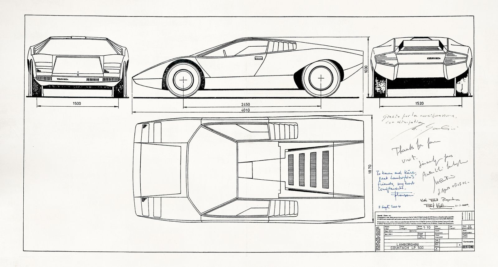
A Gandini-designed Lamborghini where every angle serves speed
A James Blake vocal that hovers between human and ethereal
A margherita pizza where every ingredient justifies its presence
This is the result of a thousand micro-decisions all pointing the same direction. When intention is clear and execution is clean, you get presence.
Beyond Seeing
When you understand visual grammar, you stop accepting ugliness as inevitable. You notice why certain spaces drain you and others lift you up. You start making choices that compound into beauty rather than chaos. You begin to see that every decision—where you place a lamp, how you structure an email, which route you walk—is a chance to create rather than just consume.
Start small. Make one corner of your world more considered. Then another. Beauty builds like compound interest, one good decision enabling the next. Before long, you're not just someone with good taste—you're someone who makes things better.
The end goal isn't to become a design critic. It's to live in a richer world and maybe—just maybe—add something beautiful to it.